iSchoolApps - How to Change and Amend your App Images
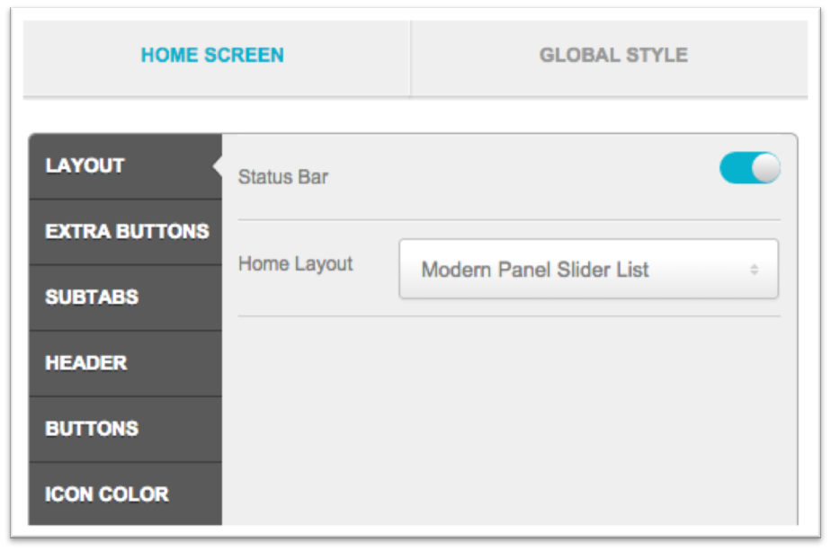
The Home Screen section, under the Appearance Step, is where you’ll customize your app’s landing screen. There’s a lot to be discovered here, so below is a general outline of each item, including what exactly it controls and how to adjust it.
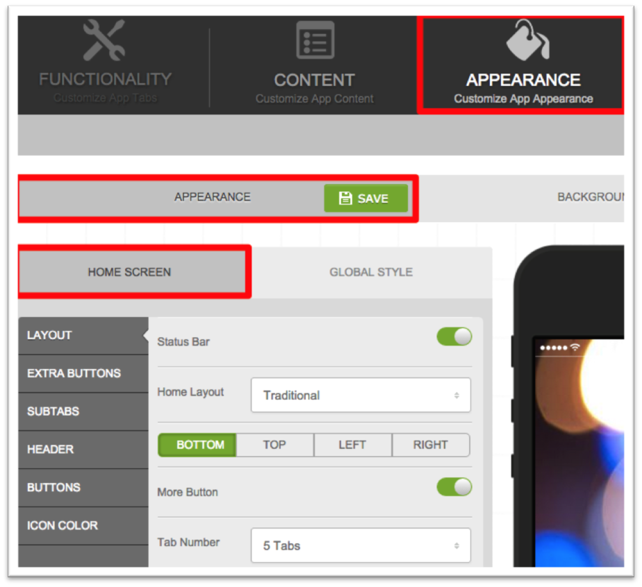
Layout (Traditional Selected)
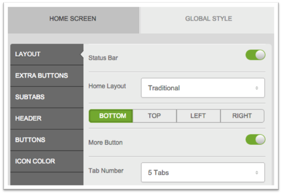
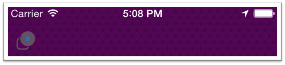
- Status Bar:Controls whether or not the status bar (see Fig. A) appears on your home screen. It’s not possible to disable the status bar throughout the rest of your app—it will always appear elsewhere.
- Home Layout: Select the main layout for your app. You can choose from Traditional, Modern Panel Slider List, and Modern Panel Slider Tiles (see Fig. B).
- Bottom/Top/Left/Right: Controls the position of the tabs on your home screen. You can place them at the bottom, on the top, or on the left or right side of the home screen.
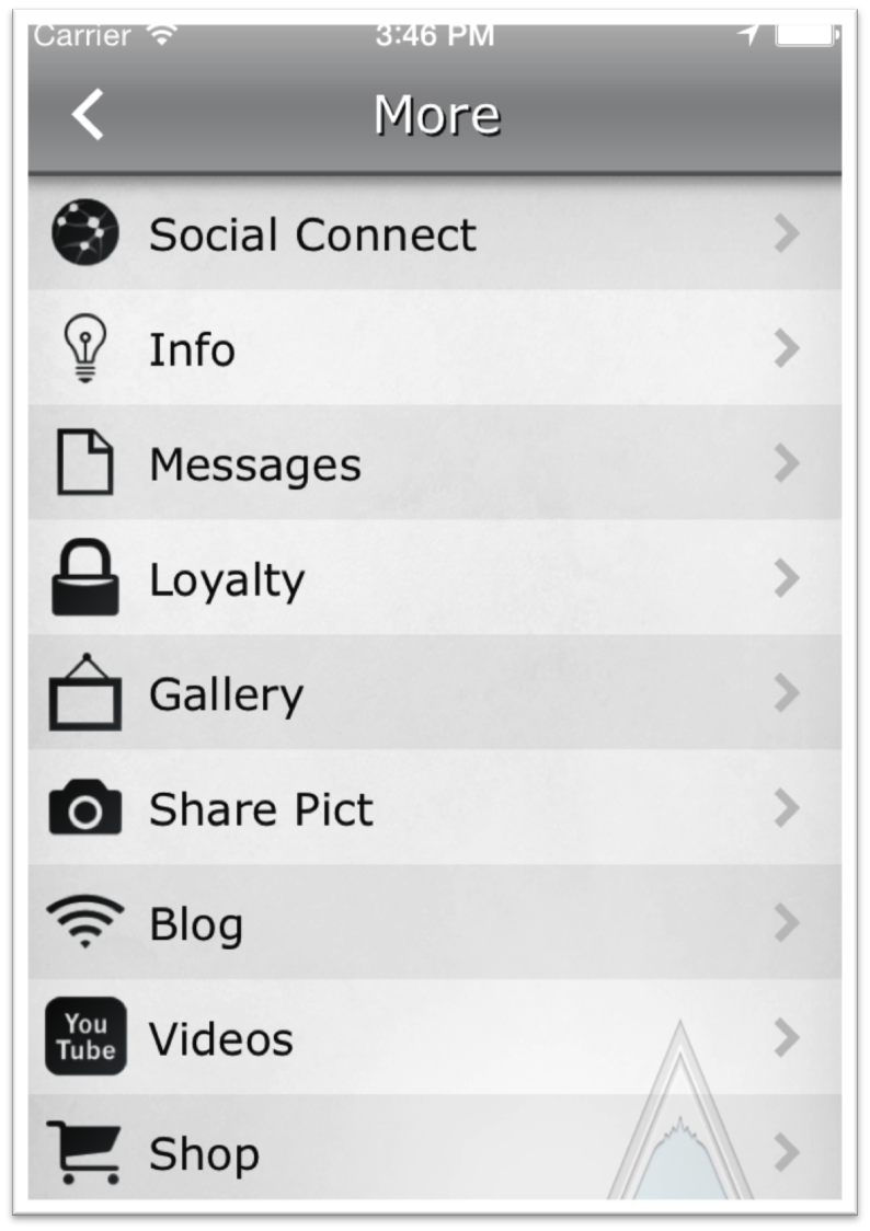
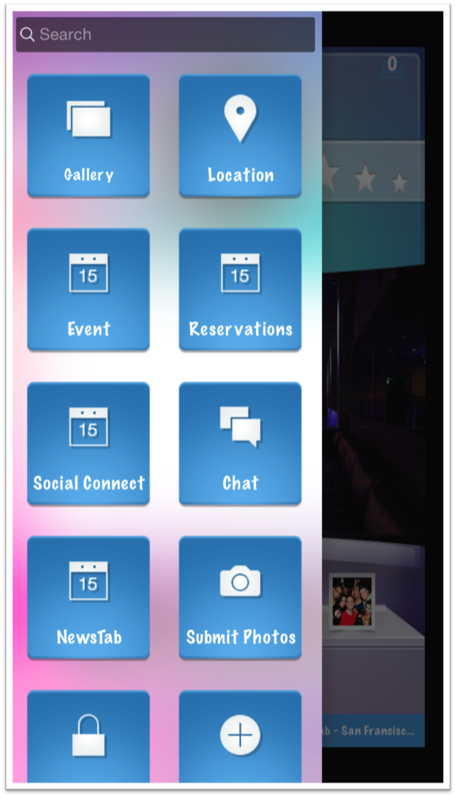
- More Button: Enables the More menu option, which places a More button (see Fig. C) on your home screen. This clicks through to reveal the remainder of your tabs in one organized, list menu (see Fig. D). The alternate option (if More is disabled) would be the scrolling layout, where users swipe between “pages” of home screen tabs to reveal more.
- Tab Number: The number of tabs that will appear on your home screen. Note: If you have the More button enabled, it will count as one of the tabs. (For example, in Fig. C, this app has 5 tabs enabled for this setting.)
- Rows (Traditional/Scrolling only): The number of tab rows that appear on your home screen. This setting only appears when the More Button is disabled.
More Button disabled:
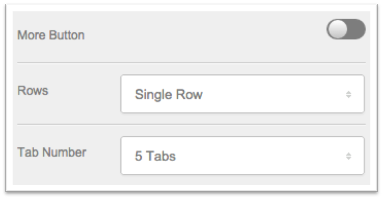
Figure A
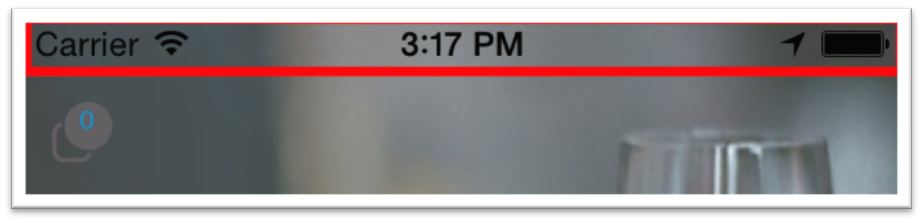
Figure B
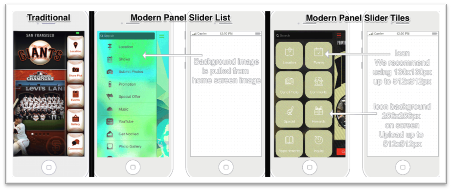
Figure C
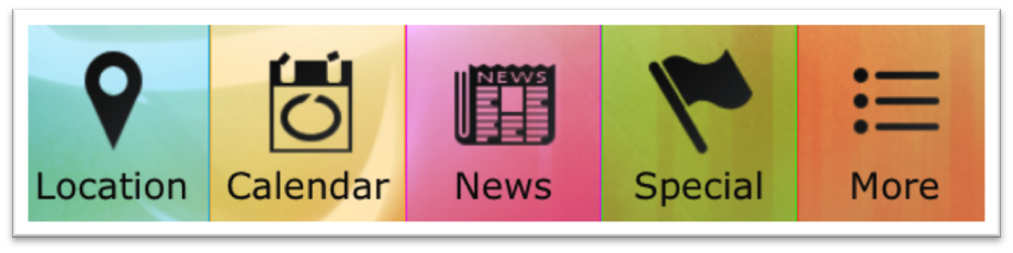
Figure D
Layout (Modern Selected)
When a Modern layout option is selected, the additional layout options won’t appear in this section. Check out examples of the Modern Panel Slider List (left) and Modern Panel Slider Tiles (right) below.
Extra Buttons
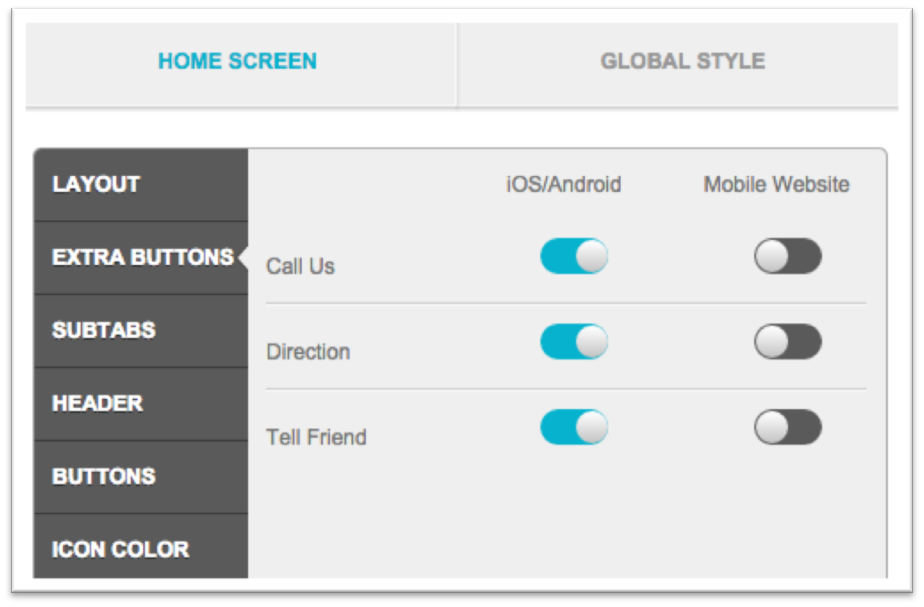
The Extra Buttons section allow you to place quick option buttons on the home screen of your app. You can opt to make them native-only (iOS/Android), HTML5-only (Mobile Website), or active for all three (by toggling both on). These buttons are positioned at the bottom of the home screen when a Modern Layout is enabled, and right above the tabs when a Traditional layout is enabled (see below for examples).
- Call Us: Will pull up a one-touch dial window with the phone number (set in the Contact tab) displayed. The user clicks OK to call.
- Directions:Redirects the user to Apple Maps, where the navigation field will be pre-filled with the address (set in the Contact tab).
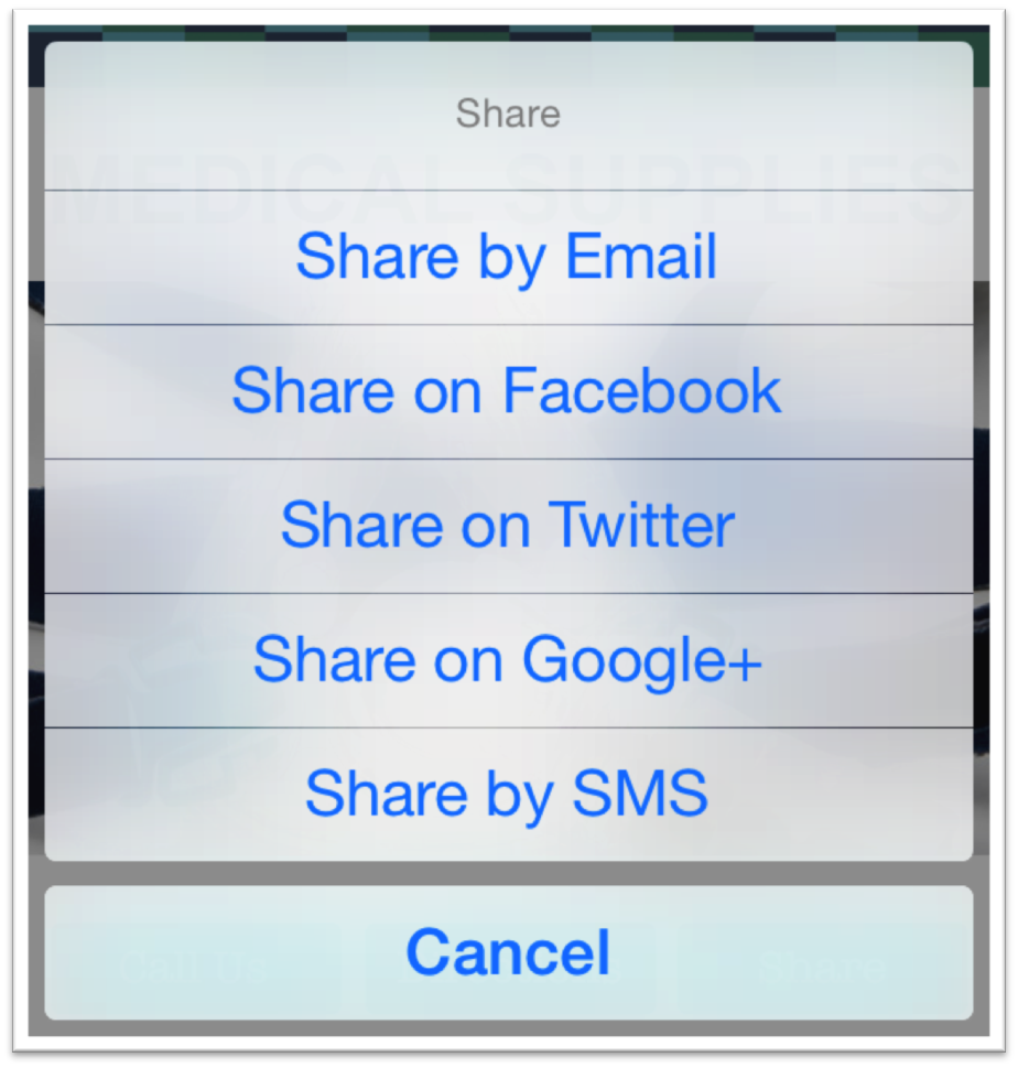
- Share:Gives users the option to share the app’s listing URLs (pulled from the Info section) via Email, SMS, Facebook, Twitter, and more. More info here.
Modern Layout
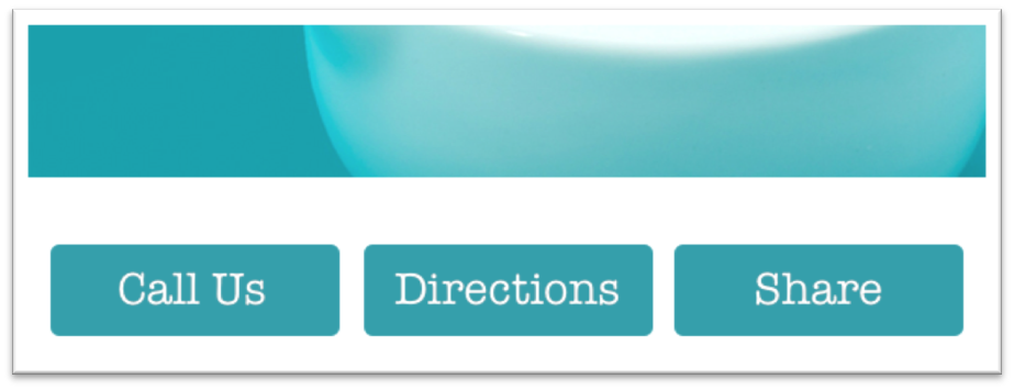
Traditional Layout
Share Button
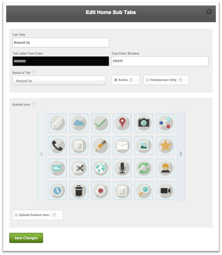
Subtabs
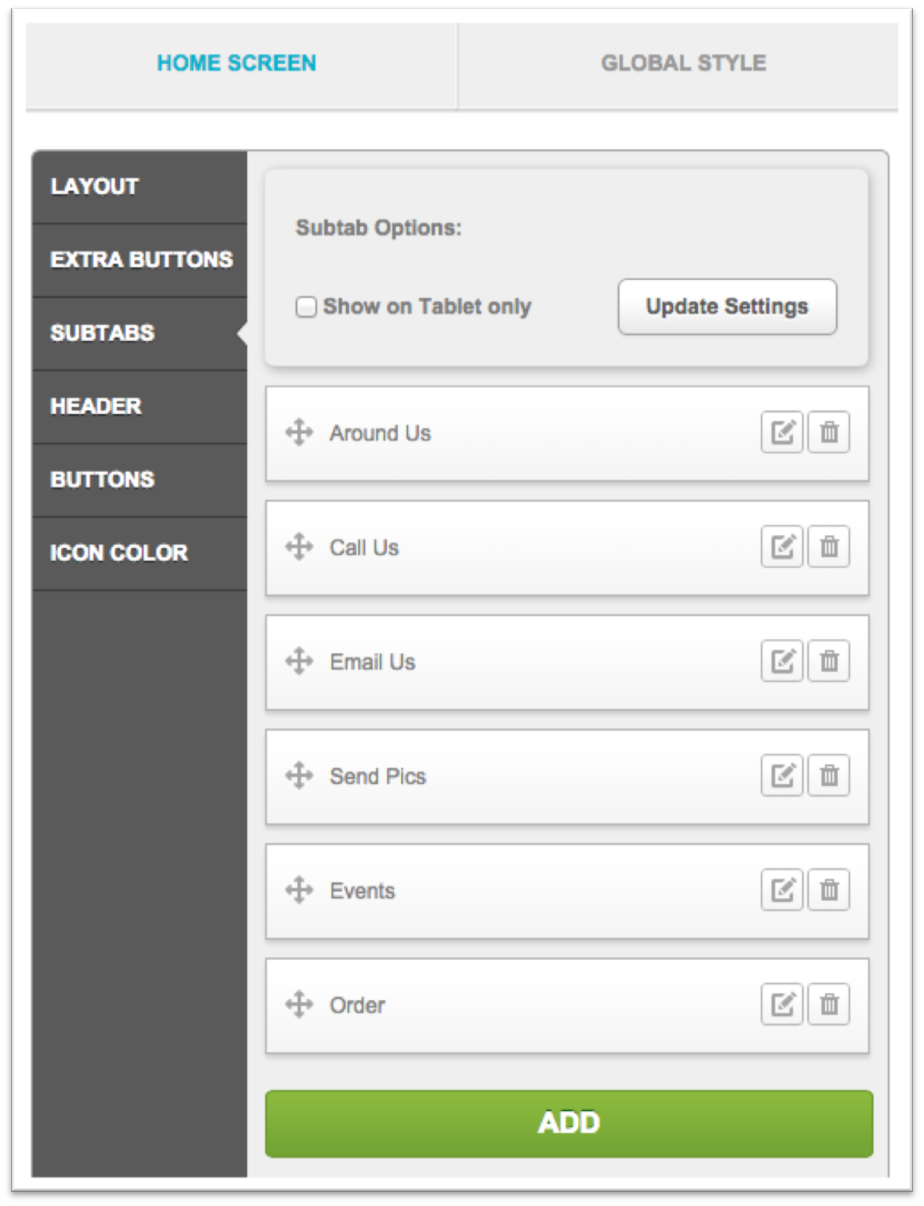
Subtabs appear on the home screen of your app, and are shortcuts to features within the app. You can add up to 6, and when clicked, they’ll direct the user right to the tab you’ve linked up.
How-To
- Click the ADD button to get started.
- In the pop-up window, input a Tab Title (the name that will appear on the home screen), adjust the colors, select the tab you’d like to link to, and check the Active box to enable it. You can make your subtab Homescreen Only if you’d like it to replace the tab in the main menu.
- Select an icon, or upload a custom icon.
- Click Save Changes to finish up.
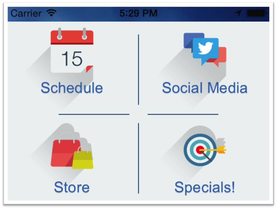
Note: Subtabs will automatically position on your home screen, starting at the top left. In the example below, the designer added nice touches to the home screen background image to make the design more appealing. You can get creative with this as well!
Header
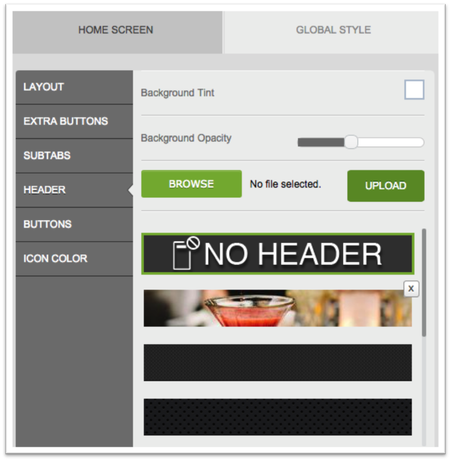
Here you’ll select a header image, if you’d like one to appear at the top of your app’s home screen. You can choose from the pre-loaded options in the bottom scrolling menu, or upload your own. For example, the header highlighted in blue in the above image is a custom header. Any time you upload your own header, it will appear at the top of the menu.
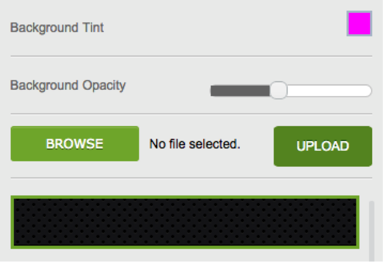
- Background Tint: When you decrease the opacity of your header, you can set a background tint for it. For example, the header in Fig. E is just the first pre-loaded header with a slightly decreased opacity and a pink background tint.
- Background Opacity: This sets your header’s opacity, with the far left being most opaque (non-transparent) and the far right being least opaque (transparent).
Figure E
Settings to create this header:
Buttons
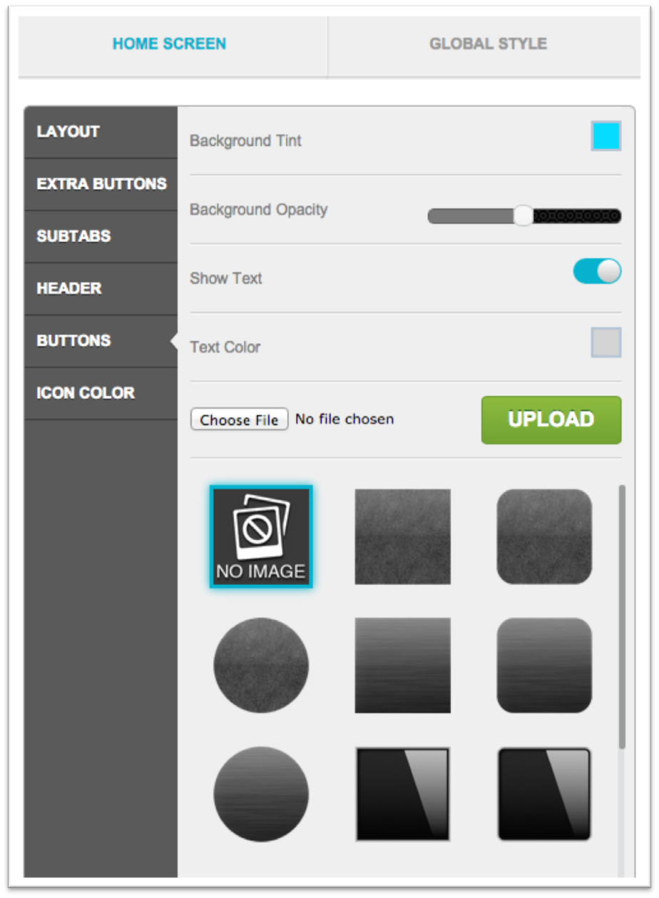
In this section, you can design the buttons for your home screen tabs, selecting pre-loaded options below or uploading custom buttons for a more personalized look. For custom buttons, just upload a 130x130px image, and you can then use it as the background for any of your tab buttons.
- Background Tint: This sets the color for the whole row of tabs. Keep in mind, each button choice will produce a slightly different shade based on its design. Play around with each one to see what looks best.
- Background Opacity:This sets the opacity for your row of tabs, with the far left being most opaque (non-transparent) and the far right being least opaque (transparent). If you want to display the background tint more, you’ll drag the bar farther to the right; less, you’ll drag it farther to the left. If you set it all the way to the left, you won’t see the background tint at all and the buttons will return to their original black.
- Show Text: Toggle this on if you’d like to display the tab title on the buttons. Toggle it off if you’d like only the icon to appear on the buttons, with no text.
- Text Color: If you’ve enabled the Show Text option, this controls the color of your tab title text.
Icon Color
You’ll select the colors for your icons here. Just scroll through the list and preview each option, selecting the one that works best with your app’s design.
Note: You can upload custom icons under the App Layout section of Step 3, or by hovering over the tabs in the simulator to the right of each section in Step > Appearance. A pencil icon will appear when you hover over each one and lead you to the Individual Tab Details window when clicked
You’ll select the colors for your icons here. Just scroll through the list and preview each option, selecting the one that works best with your app’s design.
Note: You can upload custom icons under the App Layout section of Step 3, or by hovering over the tabs in the simulator to the right of each section in Step > Appearance. A pencil icon will appear when you hover over each one and lead you to the Individual Tab Details window when clicked.